Thursday, March 31, 2016

Sneaker Calendar Layout

I made this layout for a calendar and now that I look at it, I think it needed a title. But honestly, I don't think my brother would really notice or care. This is my nephew and niece with my sister's dog. 

The background paper is by Hot off the Press and the purple paper at the bottom is by Sunborn. I made the swirl at the bottom with an old Creative Memories trimmer thingy. The patterned paper at the way the bottom is by Colorbok and it has been punched with a Stampin Up border punch. 

In black by the picture is a Tim Holtz/Sizzix die that I cut in half to place on each side of the photo. The die outside that is a Cricut cut from the Art Philosophy cartridge. I know the shadow paper is by Die Cuts with a View. I would guess that all the cardstock on this layout would be by Recollections. 

The cute sneaker ribbon is by Offray. I have to tell you when my mom gave the ribbon to me I was like-ummmmm....what the heck am I going to use this on? Well... crazy enough when I saw this picture the first thing that stood out to me was their shoes. So.....Ta-da! Enter the crazy ribbon from my crazy mother. Crazy runs in our family! Lol


Thanks for looking.

Scrapbook.com-Cricut challenge with a twist of an animal

Wednesday, March 30, 2016

65 Year Old Sequin Card

This card required a lot more work then I usually put into a card. I die cut the 65 using my Cricut and the cartridge CTMH Art Philosophy. The purple cardstock is by Recollections and nn that same colored cardstock, I glued a lot of sequins in rows with Ranger's multi medium matte adhesive. I would adhere a bunch sequins down thinking I was close to being done and upon placing the negative of the 65 paper over the sequins, I was no where near done.

When I did place the negative over the sequins I did notice that the sequins had to extend farther then numbers because I used foam adhesive for the negative and you could see into the card. I thought that made the card look incomplete and therefore I did more rows of sequins to get the look I wanted.

Once the sequins were in place and the adhesive was dry, I added the foam adhesive to the negative 65 and applied multi medium matte adhesive to those foam squares. I placed the negative piece to the sequined paper and placed a heavy object on it to dry.

 I used a lot of foam squares and in retrospect I think I would die cut a regular full piece of foam when I die cut the number. It would save time not having to pull off all those backings of the foam squares and would look better from the side.

The swirl is a Cricut cut but I'm not sure what cartridge however I know that the flower is by Making Memories and the glitter circles by Recollections. I added Glossy Accents by Ranger to the flower.


Thanks for looking.

Tuesday, March 29, 2016

Jake-E-D's Hockey

Here's another layout for the nephew's book. I'm a big hockey fan and had fun die cutting these skates with my Cricut. The title and age are from the cartridge Don Juan and the skates are from the Creative Memories Total Sports cartridge. The cardstock is by Recollections and the epoxy stickers between the two pictures on the right are by Cloud 9. I'm not sure about the background paper but the hockey stick placement worked really well with the pictures.


Thanks for looking.

Monday, March 28, 2016

Manly Monday Goal

My card today is a fun one for soccer lovers. I can say this about soccer, it was never around when I was growing up. There were no leagues or teams in my area. Then as I became an adult it seemed there was a mass movement of soccer in our city and also in the outer city limits. My niece's team in Arizona won their state championship. So it makes me think maybe it was around when I was younger and I was just blind. That is possible.

Anyway, I started this card by die cutting the word goal with my Cricut and the Creative Memories Sports cartridge. The cardstock is by Recollections and the patterned paper is by Me and My Big Ideas. The soccer ball is a chipboard embellishment that I acquired as a prize and I don't know who made it. The yellow circle is cut out using Cricut and the George cartridge.


Thanks for looking.


Sunday, March 27, 2016

New technique Easter card

I was made aware of the technique Pencil Eraser Stamping from one of the forums at Scrapbook.com. The technique was one of the many challenges last month. Here are the two sites she gave us to reference from: Artbar Blog and Cutesy Crafts. I thought it would be a fun technique to do with the church group I teach once a month. It was a success with them and they created some beautiful color combos and stunning results.

I die cut an egg shape with my Cricut and the cartridge Cricut Font and Basic Shapes. I made it an annoying color so there was no question as to the egg mask whereabouts. We used reposttionable adhesive to secure the egg die cut to the white cardstock. The sentiment can be stamped by either stamping it first and then laying the mask over it or after the egg has been stamped out. The ladies at church came up with and liked the idea to stamp it first so if they mess up the stamping there isn't much lost. Grab another piece of cardstock and try again. I personally liked the stamping the sentiment afterwards because when you start with your blank white cardstock you can plan and position the egg right where you want it. With the stamping first sometimes where you stamped isn't where you had intended the egg to go (too high or too low on the white cardstock gives a look different from the example) and have to work around that. The sentiment in this card is a very tight fit with the cross included and can be done both ways depending on your confidence in stamping. (Wow-that was way too long. I'll pick up the pace.)

The patterned paper is by K and Co with white and blue cardstock by Recollections, inks used for the egg by Colorbox and Versa Color, and then the cross is kind of unknown (I think it was made by Clear Dollar Stamps however I don't think they make stamps like this anymore. They may have gone all digital-but don't quote me on that one.) but I stamped it and the Hero Arts sentiment with black Hero Arts ink.


Hope you like today's card. Thanks for looking.


Saturday, March 26, 2016

Gotta wear Shades Calendar Layout

I made these layouts for the Christmas calendars I make for the family. I added to this original post to put photos/layouts in one post.


The title and shade are Cricut cut with the sentiment by TC Sophisticated and shades by When I Was A Kid. 

The only patterned paper that I know is the one under the picture of my husband and me and that is K and Co. The rest are all scraps from my stash.


Cricut border, Title, and flower. Circle cut out with Creative Memories cutting system

Thanks for looking 

Friday, March 25, 2016

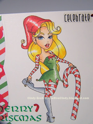
Sassy Candy Cane Christmas Card


Here today with my Sassy Studio Designs (closed) anything goes card for the sponsorship at A Beautiful Mess (closed) . I printed this beauty out of Cryogen cardstock and colored her in with Copic markers. I die cut her out using a Spellbinders die and cut off the top. The red border is also by Spellbinders with Recollections cardstock. The card base is green cardstock by Making Memories and the patterned paper is by Craft Smith. The stickers are by Sticko/EK Success and Mrs Grossman's. The flower rhinestones are unknown.
Thanks for looking.

Thursday, March 24, 2016

March Sketches in Thyme Project Life

This month at Sketches in Thyme Project Like our sketch was this one by Emma Pescott.


I did a regular LO with the card in it. The white of the card is sprayed with blue and then red Smooches Spritz by Clearsnap. I used the negative of star die cuts from CM and moved the template a little with each color. I added some Perfect Pearls powder on top of the white cardstock after the spritz dried. I used a very old "Good Times" die cut that I don't know the company but it fit the color theme of my layout. The red and blue stars are chipboard that I painted. The yellow die cuts are by Quickutz on the bottom and then a Circut star on foam tape above. I wrote the journaling with a Copic Multi-liner in black. I hate my handwriting but it's much quicker than using stamps.


 The transparency is by Daisy D's that I attached with Making Memories eyelets. The "2" is a Cricut cut using the Micky font cartridge. The "nd" is a stamp by The Paper Studio with red ink by SU. Finally the star patterned paper is by Die Cuts with a View.


Thanks so much for looking.

Wednesday, March 23, 2016

I Just Love You Card

I created this background with a stencil by The Crafter's Workshop and distress ink by Ranger. The white and blue cardstock is by Recollections. I think the grey cardstock is by Coredinations but I do know the die cut is by Spellbinders. The flower is an old one by Prima. I added some Stickes to the petals and a rhinestone brad to the center. 


Thanks for looking.

Tuesday, March 22, 2016

Oh My!

I have another layout for my nephew's scrapbook to share today. I have many photos from my sister that are just random pictures from each year. I decided to combine these summer photos from 2009  into one layout. I made a title that my sister will smile at because she is a huge Wizard of Oz fan. (I hope she gets the reference) 

With the tile my hope was each word of the title matches each photo from the left to right. The first picture is of them fishing. The second picture is at Berlin Raceway for a race. The third photo is my sister and kids visiting a cousin. That's probably a lot deeper then it should be. I tend to over think things sometimes. lol. 

I'm unsure of the paper manufacturer but I did do some misting in the upper left corner with a Tattered Angels mask and Glimmer Mist. 

The title and date are Cricut cuts, Cuttin' Up and Don Juan respectively. The tag on the upper right is from the CTMH Art Philosophy cut. 

I stamped the tag with letter stamps by Lawn Fawn however I had to cover them because the couple in the top right photo do not want to be identified. Fair enough. I have ways to blur their faces and names to respect their privacy. I have no problem with that. I identified the places that the photos were taken with Lawn Fawn letter stamps just below the photo with Hero Arts ink.


Thanks for looking.

Monday, March 21, 2016

Manly Monday Celebrate Trucks

Here again with Manly Monday. Glad you stopped by to check out the masculine card of the week. This card is like another card/post I did back in September 2015 and I want to give you a link to that post because it gives credit to the card I followed as inspiration.

The truck stamp is by Tim Holtz/Stampers Anonymous. I've stamped it and the sentiment by Fiskars with Charcoal Hero Arts ink. The circles the truck is stamped on were cut with the Creative Memories cutting system. I inked the last die cut with distress ink by Ranger. The patterned paper on the top is by Papertrey Ink and on the bottom the paper is by Sunborn.


I used the same products for this card with the patterned papers switched around.


Thanks for looking.

Sunday, March 20, 2016

Masking Easter Eggs Card

Here's an Easter card since we are one week away from the blessed holiday. The egg stamps from left to right; the first three eggs are stamps by Stamp N Plus; the green egg in the center is a stamp by We R Memory Keepers; The aqua colored egg is a stamp by VAP! Scrap; and the last two eggs on the right are stamps by Stamp N Plus. 

The inks used from left to right: yellow Stampin Up; mint and pink by Umbrella; green by Tsukineko; aqua ink by Hero Arts; and purple and the blue by Stampin Up. For the cross stamp (Clear Dollar Stamps) and the sentiment (Stamp N Plus) they are stamped with black ink by Hero Arts. The embossed folder used on the purple cardstock in the center is by Cuttlebug/Provo Craft. The cardstock the eggs are stamped on is by Westrim Crafts and the blue and purple cardstock is by Recollections.


Thanks so much for looking.

Saturday, March 19, 2016

Easter Blessings ATC's

I'm trying out a swap, making ATC's (Artistic Trading Cards). I worked really hard on these and I hope you like them. The theme for this first set is Easter. 

I do not have a cross stencil in my collections. I made my own by die cutting a Spellbinders cross out of cereal board. I added some repositionable adhesive to the center flaps of board and taped the stencil down like always. I applied Dreamweaver Stencils silver embossing paste with a palette knife in the usual way and let them dry overnight. The paste seeped out under the stencil but instead of throwing them away I went with it. 

I'm not going to preach. I want to share with you my thoughts and how it inspired me for these cards: 

I just can't imagine that doing to Jesus what those barbarians did to him was acceptable. The way they treated him is total unfathomable to me. I shake my head to think that a person could do such things to another human being. What a distressing time to live in. And here is how I applied my thoughts to my ATC's: 

I took an Exacto knife and rubbed the extra embossing paste away from the cross. This made the paper tear but not all the way through. I continued distressing with this knife around the cross on purpose for a more and more distressed look. I added distress ink (Squeezed Lemon) with an ink blender and then added Daffodil Delight ink by SU to the center. I distressed the edges with regular scissors opened and added more ink until I liked it.

Then came the ribbon. I'll make this shorter, well I will try. I could not find any purple ribbon so I inked white ribbon but it didn't dry fast enough. Suddenly I found this ribbon (I swear it wasn't there when I was looking) and I wasn't totally thrilled but whatever let's get this done. 

I had to cut slits on the top of the cross, near the center, to have a place to fed the ribbon through to loop first and then hang one on each side. Once I finished that the ribbon wouldn't lay flat. I was going to use an iron but wasn't confident what it would do to my paste. At this point I was way too far into this to mess it up on the last few steps. I flipped the card over and ironed from the back at a very low heat. It took me...way longer than I wanted it to but it was working so all is well.

The sentiment is a Stamp N Plus sentiment that I stamped with black Hero Arts ink. The background is white because anything I would have done to it would have been a waste behind the crosses and I didn't want take away from them either. Any more and the card would be too busy.


Here's a close up.


The other theme I signed up for is/was Flies in the Sky. Here are the three different ones I came up with. The cards don't have to be different. I just happened to be trying out different ideas and they turned into the cards.


I made the sky with multiple colors of distress inks and sprayed the paper with Perfect Pearls spray color Sunflower Burst by Ranger. Very pretty stuff that I highly recommend. The stamps are by Lawn Fawn with white heat embossing and the red is SU ink.


I finally had a reason to use that "I have to have it" honeycomb stencil by Tim Holtz. Again I used different colors of distress inks and an ink blender to create the angled pattern and sprayed it with the same stuff as above. The sentiment is a Cricut cut from the Just Cards cartridge and the bees are acetate dies by K and Co. I used the Xyron to adhere the bees to the cardstock.


Last one was a mix of experimenting. The green is Crackle Paint (Ranger) and I inked the edges with the same color distress ink-Peeled Paint. The top was inked with Salty Ocean distress ink. The sentiment is a stamp by Sweet Stamp Shoppe stamped with black Hero Arts ink. The scallop ribbon at the bottom is velvet and I stamped grass on it using a stamp by Lawn Fawn and green ink by SU. 

I made the butterfly by applying alcohol inks to glossy cardstock and once it was dry stamping the butterfly with black ink. I had actually stamped three of them but they didn't all stamp perfectly. So instead of throwing them out, I used the matching die to cut them out and layered them on top of each other putting foam adhesive in between each layer. I die cut the foam adhesive with the same die that I used for the stamps and glued the butterfly to the card.


Wow! That was a lot. Thanks for staying with me. I hope you are crafting this weekend.

Friday, March 18, 2016

Boy Teddy Bear Duet

I have two baby cards for you today. They are similar so I figured put them together in one post.

The bear stamp is by Stampin Up and it is stamped with Tsukineko brown ink and colored him in with Copic markers. I fussy cut the image out with a small white border around him and adhered him to two Cricut cuts. The first one in white patterned paper by The Paper Studio is from Close to My Heart Art Philosophy (Square 7) and the blue and brown patterned paper by Deja View is on the same cartridge as Square 5.

There are a lot of layers to this card. Starting closest to the card base is a light blue cardstock by Recollections. The white on top of that is the same patterned paper the bear is on. The darker blue paper is by Paper Pizzazz and the brown with circle like stars is by The Paper Studio. The sentiment is on Stampin Up grey cardstock and is made using Lawn Fawn stamps and brown ink. I think I should put an exclamation mark at the end. Hmm. 


The next card I stamped and colored the same way but I didn't cut him out. Instead I die cut the image with a Design Objectives die and inked the inside with distress ink. The die behind it is same paper as above and same cartridge (Square 3). The embossing on the brown cardstock is a Gina Marie folder called Fluff. That brown cardstock is by Coredinations. The blue grid patterned paper is by Basic Grey and the white paper is same as above. The sentiment is a stamp by Fiskars stamped in brown ink and the epoxy sticker is by Sticko/EK Success.


Thanks for looking.

Thursday, March 17, 2016

Calendar Layout Beers to You

Happy St. Patrick's Day. I don't have a card for the occasion because really what would I do with it?I chose this layout because it has green in it and drinking beers is commonly associated with the holiday.

The "Beers to you" can is a Cricut cut found on the cartridge Father's Day Card. I cut the image out with white cardstock by Recollections however it didn't quite fit my layout because if you look closely there is a comma after the word "you". That is because it cuts out as "Beers to you, Dad". I tried to cut out the word "Dad" in the Cricut Craft Room but couldn't get it to work out the way I wanted. So I cut the can out and discovered it was super easy to cut the word "Dad" off of the can. I don't think you can tell besides someone may think why would the comma be there. It's funny because I can't remember if the word "Dad" was attached under the "to you" or to the arch at the bottom. Would you have caught it if I didn't point it out? 

Anyway, I matted the can onto some packing I found in my stash which is a beautiful gold. The border punch is by EK Success with Stampin Up cardstock and the background papers, blue cardstock and patterned paper, are by Pressed Petals.


Thanks for looking.

Wednesday, March 16, 2016

Arrow Scrapbook Layout

I really like the background of this layout and was sad when I had to cover it up with photos. The arrows are Cricut cuts that I arranged in Cricut Craft Room. I used the cartridges Bits and Pieces and Small Talk frames on the grey cardstock by Coredinations. Then I placed a Recollections piece of yellow cardstock underneath.  For the titles I used the Cricut cartridge When I was a Kid with the matching shadows and using Recollections cardstock. The 2005 are stamps by Stampin Up with ink by Hero Arts. The ramp and skateboard stickers came from Jolee's/EK Success.


Thanks for looking.

Tuesday, March 15, 2016

Frozen Celebrate card

Today Sassy Studio Designs is sponsoring the challenge at CCC Digi Creations. The theme is Add Some Sparkle. I am using the Snow Queen Sassy.

I printed her onto Strathmore watercolor paper and colored her in with Peerless watercolors. I did color in her cape with Stardust powdered chalk mixed with paint. I die cut the image out with a Sizzix die and inked the inside with distress ink and an ink blending tool both by Ranger. I took the same paper as the background and trimmed around the image with a small edge left around the image.

The patterned paper is by Scrappin' Sports and More and it is dry embossed with a Cuttlebug folder. I added Perfect Pearls powder to the embossed area to increase its sparkle. The white star is a Quickutz die the I inked the edges with distress ink and then covered with glitter by Stampin Up. The blue star is chipboard that I painted with Plaid silver paint. Then I placed the star onto Sizzix adhesive sheet and then covered with Stampendous blue glitter. The sentiment is by Fiskars stamped with Hero Arts ink.


Thanks for looking.