Sunday, January 31, 2021

1983 May Wedding Layout

My husband is on the left.
The patterned paper for this layout is by Daisy D
on the bottom:

On the bottom row of embellishments, on each side of the small picture, I used a Creative Memories punch for two white cardstock squares and added Creative Memories stickers on top.

Then, I layered the decorative square punches, also by Creative Memories, onto regular squares.
The pink glitter paper is by Die Cuts with a View. 
The ring stamp is by American Crafts.


On the right side, the heart, the word May, and the year are stamps by Stampin Up.
The patterned papers are from my stash. 
This is the oldest boy’s wedding.


Thanks for looking.

Saturday, January 30, 2021

May You Sentiment set of 3 Cards

Here are three cards using the same Close to My Heart sentiment.

I inked the sentiments with distress ink by Ranger

The die-cut leaves are by Spellbinders. 
The sparkly leaves were cut out of a store-bought card

The patterned paper is by My Mind's Eye and the dry embossing folder is unknown to me. I borrowed it from a friend.

What kind of card would you think this is?
Who would you send this card to? 
Idk if it's a donation card to an older person in a nursing home. Thoughts?


Thanks for looking
UPDATED SPACING 10-1-21

Friday, January 29, 2021

Intricate Cricut Love card

This whole card was cut out using my Cricut.
For whatever reason, I chose a patterned paper is by Die Cuts with a View to go under the word and it was too busy. 

So to easily fix this busy paper, I took the black soot distress ink pad and rubbed it all over the pattern paper to make it all black. 
Isn’t it pretty?
And problem solved, right?

No. Rubbing the ink pad onto the paper created a new problem. See below. 

Pictures outside are so much better. 


Something to consider, this card doesn't stand up very well.


When I did my inking the paper with the black soot ink, the other side of the paper swirled around on the slippery paper underneath it and proceeded to give the inside of the die cut this black ink unique pattern.
I forgot to take a picture before the added stamped background. 
Pretend you don't see the yellow pattern.

That caught me off guard. Like, crapola-now what do I do?
Here’s what I did, I stamped it with an old Stampin Up background stamp that has hearts on it.
It didn't cure the problem but didn't make it worse so I'm going with it.


I honestly don’t have a purpose for this card.
I would think wedding but I may stretch it and use it as an anniversary card. 

Thanks for looking

Thursday, January 28, 2021

2 Bright Flower Cards Upcycled from one


Today I have a set of cards made from one card.
The original card appeared to be computer generated 
It had two different images, one on the front and one on the inside. That's a lot of printer ink.


For the first one, I thought it would make more sense if I showed you the pieces from which the card was made from. 
I used a yellow background from the red present card that you can see in the photo on the right, to go behind this black and white thank you card.


The black and white thank you card is underneath the flower of my card.
I layered black cardstock from the card above behind the flower. 
The green is the card base. I was happy to be able to use this obnoxious green cardstock on something. It matches perfectly.

4 of the 5 layers of my card were recycled from other cards


On this second card, the second image is layered on top of the yellow cardstock from the inside of a Mother's day card

Then I added 2 K and Co. border die-cut/stickers to the bottom.
And that's it.


Thanks for looking

Monday, January 25, 2021

Manly Monday Thumbs up for Kenny K card


I found another printed out Kenny K digital stamp that wanted to be finished. so I had the opportunity by using the scraps of a premade layout that was cut smaller to fit a calendar. See below.
For now, I colored him in with Copic Markers. Some of the blue colors I used were
BG05. BG10. BG32. B00. B29

The sentiment is a stamp by Inkadinkado (I love that word)

The border punch is by Fiskars with a paper by Making Memories.

The patterned paper is by My Mind's Eye and on the right is by Die cuts With a View


The link below is another card with this image

Thanks for looking

Saturday, January 23, 2021

Spring Colored Flower Up-Cycled card


-BEFORE YOU LOOK AT THE PICTURES, READ THIS FIRST QUESTION-

What is the first thing that stands out to you when looking at each picture of the same card?

-OKAY, ON WITH SHOW-
We have a few months until we can say, "Spring is in the air" and that's okay. The reason we live in Michigan is for the change in seasons. 
 
In the months to come, things will get brighter and brighter which leads me to this card.
This card is soft and light, except for the orange paper, which I think that bright orange brings your attention to the flower. 

What I like about this flower picture, besides the beautiful colors is, that it demonstrates where the light comes from and where you see the shadows. That's where the orange comes in. It leads your eyes to the lower-left corner of the flower but then that leads you to look at the rest of the image.

 It's also a great example of how using shading can enhance the images that you color with Copics or whatever you color with. 

I was going to delete one of the photos but I liked the way that it showed how even the angle in which you take your pictures can affect the way your cards are viewed and where your eyes go to first. That can be a big deal if you're trying to sell something that's on your card. 

The first photo supports my theory of where the light comes from accents differently compared to the second photo where the view is straight on.
That's why I asked the question before you look at the pictures.

Well, I didn't add a sentiment to the front of the card so I could use this card for just about anything.
I can see it as a TOY (thinking of you) or sympathy card but it would fit for a get well or even a birthday card.


Babbling:
There is one pleasant thing around this time of year, we are gaining daylight every single day. We noticed that we do not have to put our outside lights on until after 6:00. Good because our electric bill was way more than last year. 

Silly thing-I pay that bill and when the notice came, I was not happy. I tore off the bottom portion and placed it on hubby's counter with numbers from last year and those from this year. At the end of those facts, I put a nice note saying we have to work on turning off lights when we leave a room or are not going back downstairs. I'll keep you posted.

Thanks for looking

Thursday, January 21, 2021

Sending Love and Sympathy Cricut Card

For my card today there's a little controversy on the letters.
This whole card was cut out using my Cricut. 
Controversy.
My husband says the word sending is hard to read.

Here are his thoughts: 
The S needs to be finished with the swoosh back (to the left).
The E looks like a C because the line that creates the loop is not extended down far enough.
The N could really pass for an H.
The D needs to be connected.
The letter I passed his inspection.
The G was not mentioned in the conversation.

For someone that doesn't really look as though he cares about my creations,
this one card really ticked him off. SMH
Yes, he has a point but seriously, let's take a minute and rebuttal
The recipient isn't going to analyze it the way he did. 
And the card will probably get thrown away.


Here's the negative of the word Love.
The patterned papers:
Green polka is by October Afternoon
Black is by Creative Memories 
The yellow patterned paper flowers are by Crate Papers.

The orange, green leaves, and yellow cardstock are from my stash.
The yellow background cardstock is dry embossed with the Cuttlebug Polka dot pattern. 
The yellow flower punch is by Creative Memories punch.

I placed flower brads in the center of each flower.
 The leaves of the flowers are from a different Cricut cut. I haven’t figured out which one. I found these leaves on my craft room floor.


I had asked a friend which of the two options in the pictures below did she like most and she liked the black.
I used both because the green paper was already the correct size and I like layers. 


Side note: I always think that I should pick a design and let my Cricut cut it while I'm working.
It will be so easy, right?
No. It's not. 
The paper starts to drag and 
then the different colors of cardstock need different mats.
The thought seems like a great idea that I can't figure out how to make work.

Thanks for looking


Wednesday, January 20, 2021

Dragonfly die cut For You Card


For my card today,
The sentiment stamp by Forever in Time was heat embossed white and inked heavily with blue distress ink.
The orange background is heavily inked with distress ink too.
The dragonfly die-cut is possibly by Gina Marie 
The card base was cut out with my Cricut.

The patterned paper is by Making Memories


I’m entering my card into the challenge at 

Thanks for looking


Tuesday, January 19, 2021

Blue and yellow Borders birthday card


For today’s card, I layered multiple borders by Sunborn onto the card base.
The sentiment die- cuts are by Clearly Besotted (happy) and Papertrey Ink (birthday) 
It is now evident to me that i is not dotted. Poop!


Thanks for looking


Sunday, January 17, 2021

Snowmen in Pink and Purple Christmas Cards


Things are going to get icy around Michigan. Perfect time to post some snowmen cards.

I used small snowflake stamps by Hero Arts. The single snowman is a Close to my Heart stamp. I colored him in with Copic markers.

The ribbon is from my stash and the blue with silver is by Stampin Up.

The die-cuts by Spellbinders

The patterned paper which has the colors pink and purple with a touch of black snowflake paper is by Die Cuts with a View. That paper is so old. 


My miss stamping makes it look like he's waving his hands.


Thanks for looking

Saturday, January 16, 2021

Write on your heart Card


I used a stamp from a friend's stash.
I colored the rubber part in with different colors of distress markers and then huffed on the stamp before stamping it onto white cardstock

The sentiment is vellum and it is by Creative Memories

The corners are rounded with a Marvy punch

The patterned paper behind the green cardstock is a wood grain pattern. I believe it is by Prima.


Thanks for looking


Friday, January 15, 2021

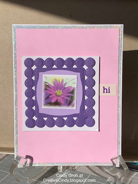
Purple flower cards with many layers

Check out how many layers are on this card

1.) Of Course, there's the card base 

2.)Next is the sparkly thank you card (see photo down below)

3.)A random piece of purple paper laying around

4.) Followed by a white square

5.)Then the purple Spellbinders die cut. 

6.)The next die-cut is a light purple rounded square

7.) The last thing is the pretty flower square punched out from a Store-bought card. 
8.)The sentiment sticker is by Pebbles


Babbling
The purple square dies that I used up above is one that I own and rarely use. There is a circle with the same edges. 
In an effort to use these different die cuts I only pulled out a few options of die-cuts while making cards.

I love to look at new products and want to buy them up BUT...I have stamps that have never had ink on them.
So, I've been trying to use what I have. and in this case, the die-cuts were already cut out/ All I had to do is see if I had the color that matched.

Next-
I've noticed that store-bought cards often have a small image on the back that matches the front image 
 and Idk who makes it


Thanks for looking


Thursday, January 14, 2021

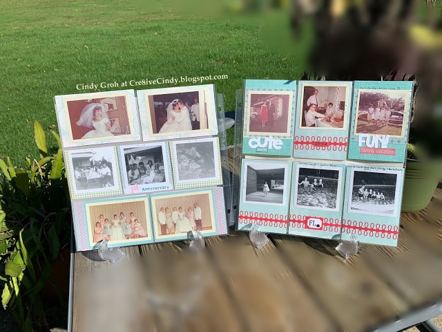
1962 Family trip to FL Scrapbooking Pocket pages.


In 1962 my MIL's family and only the family went on a vacation to FL. Here are a few of the many photos from that trip along with some cute photos that I wanted to include in this book.
This is the right side of the layout. See the bottom for the two sides together.

Alphabet stamps are by Close to My Heart

I cut words FUN and CUTE with my Cricut
The smile sticker is by Studio 112 and Family Vacation sticker...My guess is from the Current catalog.

The die-cut border is by Martha Stewart and the bottom center card has a square in it by Elle's Studio. There is a brad after the letters FL inside the square.

Patterned papers are by October Afternoon (Squares with a pop of red) and Poppy Stamps (polka dots)

(((This is terribly confusing)))
Maybe just look at the pictures


Here they are together and they're not totally the same but for me, they are close enough.


Thanks for looking

Wednesday, January 13, 2021

Purring Cat Cards

2 Cat cards for you today

I used a stamp by Michael's that I colored in with Copic markers.
The sentiment is a Hero Arts stamp 

I had these grey papers floating around in my craft room
The patterned paper is an old graduation open house invite.


I used a stamp by Close to my Heart and colored it in with Copic markers

The sentiment is a store-bought card

The die-cut-circles punch Creative Memories and the rectangle label is a Martha Stewart sticker

The patterned paper is from a Kleenex box


Thanks for looking


I’m entering my cards into the 
Animal Antics.
And
Animals


Tuesday, January 12, 2021

Rainbow Thank you Card


I'm not a rainbow kind of crafter. It's pretty and I like to see youtube people use the colors but I don't gravitate towards them. 

Now that I think about it, youtube influencers probably use all of those colors to show/promote the companies new ink colors. What do you think?

Do you use rainbow colors in your own card making?
 
This is another upcycled card where I'm using pieces from 2 different store-bought cards;
The sentiment and the green border paper. 


Thanks for looking

Monday, January 11, 2021

Manly Monday Say “Hi” to my friend alligator Card


Isn't he a cutie. I have another one colored out but I haven't found the perfect paper and things to go with him. Maybe some time soon.
anyway,
I think the stamp by Close to my Heart 
I colored him in with Copic markers and then cut him out. Nothing special with the cutting.

The sentiment word is made with a brad with each letter. It's crazy what you find when you dig into your stash.


The patterned paper is from a store-bought card

The bottom of the card is a piece or two of rick rack and torn scraps of paper as well as a piece of darker green ribbon.
I was going for the wavy look that matched but yet didn't match the background.


Thanks for looking


I’m entering my cards into the 
Animal Antics.
And
Animals

Sunday, January 10, 2021

Green and yellow Upcycled Thinking of you Card


I was able to draw and cut on my Cricut!!! Exciting!

Doesn't that sentiment look sharp! That's the only thing I made on this card.

The green patterned paper is the inside of a store-bought card and
the bottom pattern is also a store-bought card that I ripped the top off.
I do not have a before picture of it on the second card.


Thanks for looking

All of my store-bought cards have been photographed and are on a page at the bottom of the blog.

Saturday, January 09, 2021

Christmas card N Blue and gray layout.


I found this premade layout from a Novi, MI scrapbook convention class.
I cut it down to 8 1/2 x 11 to fit in my Christmas card books.

The patterned papers are all by Boxer Scrapbook Productions. 
I matted the picture onto black cardstock and left some at the bottom so I could circle punch silver cardstock. (both by Creative Memories) 
The number stamps are by Close to my Heart.
The blue matches her jacket and Mom's scarf and the dog bones with the edges inked brown matches the dog.
I love how it turned out. Maybe I should say, I love that the picture and the layout finally found each other to be lifelong friends. lol

Check out the bottom for my babbling.


This layout is about a former dancer of mine. She is a special young lady that I had the opportunity to watch grow up from a cute little girl to a grown woman. I loved her so much that I made her a large scrapbook for her graduation. 
Scrapbookers know that it takes time, a lot of time to make a scrapbook for a teenager. I wanted it to be perfect when she looked at it and I really wanted to be proud of the work I had done.

The scrapbook I made her showcased her years of dance. She started young with one dance for recital and by the end of her high school dance career, she was in multiple dances
Listen to this-She wanted to write on the pages about each dance. I don't like to journal so I was amazed and impressed by this 18-year old little woman.


I wanted to point out the sidebars:

SEARCH THIS BLOG
 Type in what it is you're looking for and You can usually find it. I try to label each post to make it is easier 

BLOG ARCHIVES
This column shows the date on which I posted something 

MANUFACTURER/COMPANY LABELS
It's interesting to see who has the largest numbers. There are a lot of stamps from, Deep Red Stamps and Hero Arts.

TYPED OF PROJECTS
This is where I'm more specific about the project. Instead of saying "card", it will say "graduation card" or "thinking of you card"

PRODUCTS I HAVE USED-
This last label shows any products I've used that may be out of the ordinary

Thanks for sticking with me until the end. I've been falling asleep as I write/ type this out. I HOPE THE GRAMMAR IS SEMI CORRECT.

Friday, January 08, 2021

Flower cards

Two flower cards. Nothing too special but good one to add to my stash.


I used a sentiment stamp by Lawn Fawn 

The die-cut is by Spellbinders 

The fussy cut flower, which it and the background paper are from a store bought card.
That’s a pretty background that you would never know was from a card. It makes me feel like I’m cheating in my card making by using parts from cards bought in a store. 
Do you ever do that?


I used a sentiment stamp by Hero Arts and a flower stamp by Stampin Up

The brown paper is dry embossed with a Cuttlebug folder. 

Patterned paper by The Paper Studio 

Ribbon from my stash 


Check out these posts with that same flower stamp
This one is Two for one
From 2010. Wow!-it’s ugly but that was 10 years ago.
It was fun to look at all of my old posts under the search “flower”
Anyway.

Thanks for looking


Thursday, January 07, 2021

Butterfly cards

Why am I so behind on my posts? This is so frustrating for me to look on my blog and not have anything posted when I have 80 or more waiting to be released. I need to get it together. Lol

The die cuts are by Spellbinders 

The border punch is by Fiskars

This butterfly stamp, card on the left is from Etsy

The butterfly on the card on the right is a die cut I found in my stash.

Sentiment stamps are by Clearly Besotted and Mama Elephant 

The patterned paper is by Provo Craft and Cosmo 


Thanks for looking

I’m entering my cards into the 
Animal Antics.