Showing posts with label Robyn's Fetish. Show all posts

Thursday, December 15, 2022

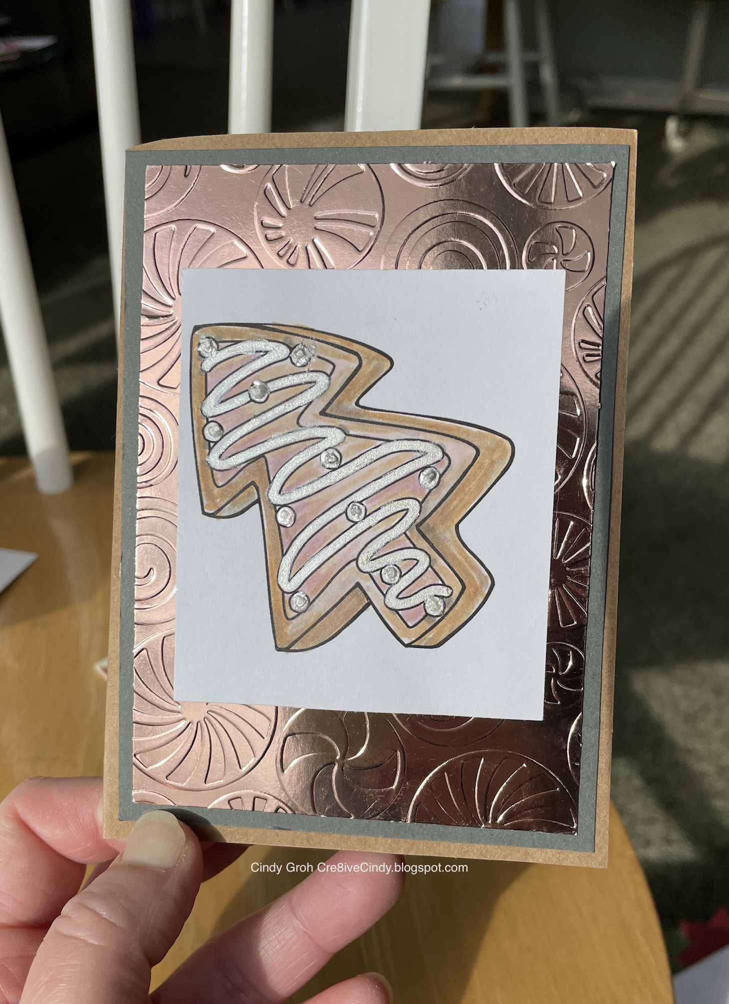
Decorated in pink is a Christmas Cookie Card


 I used the Christmas Cookie image by Robyn's Fetish. ( No longer in business). I watercolor painted the cookie with a combination of Distress inks (Tea Dye and Antique Linen) and a little water mixed with Perfect Pearls. The inside of the cookie is colored with Copic markers. Then I colored the frosting of the cookie with a paintbrush using Platinum Liquid Pearls and water. From there I used the White Opal Liquid Pearls and made the frosting dots.
Here is another card using the same Cookie stamp. You have to scroll down to the bottom of the post. I like that I was able to pull another image out from the drawer.
Thanks for looking.

Thursday, October 06, 2022

Happy Dog image colored in with Chalk card

The patterned paper by Moxxie on the bottom and My Mind's Eye on the top. I cut the image and the mat behind it with my trimmer and rounded the corners with a Creative Memories edge rounder. There's a border between the two papers and it is by Martha Stewart. The digital image is by Robyn's Fetish and colored in with powdered chalk mixed with white pearl paint both by Stampin N Plus. Then I came in with colored pencils to finish and add shadows. Thanks for looking.

Friday, August 27, 2021

Online Card Class Crushing Cardstock Day 1 Making your own patterns Christmas Cards

I'm entering these cards into the Simon Says Stamp challenge 
The stamps are by Robyn's Fetish (flower) Which I Colored with Copic markers. 
The sentiment is by Hero Arts and Deep Red Stamps (Merry Christmas). 
The die-cut on the green card was bought off eBay. 
The paper is mostly cardstock from my stash.


Thanks for looking

Wednesday, May 29, 2019

Our Father Card

This card is a little bit smaller than I normally make. The background stamp is by Hero Arts stamped with red ink. Image by Robin’s Fetish was printed onto watercolor paper and colored in with distress ink and water. I matted the image onto grey paper and adhered it to the card front.


Thanks for looking

Sunday, February 21, 2016

Easter Cross Cards

I have a bunch of Easter cards for you today. They were so similar that it seemed silly to break them up. They all use the background paper by K and Co and purple cardstock by Sunborn. They all have a border stamps by TPC Studio, and the digital images were all colored in with powdered chalk mixed with paint by Stamp N Plus.

This first card I used the Creative Memories cutting system to create the oval and shadow on the cross. The egg shape with the sentiment is a Cricut cut from the cartridge Cricut Font and Basic Shapes under the Funky Shapes tag. The sentiment is by Stamp N Plus and it and the border stamp were stamped with Stampin Up Chocolate Chip ink. The cross digital image is by SGT Stamper but I could not find her on the web to give her credit. If you know something I don't about this company or person please let me know. 


This next card features a cross by Robyn's Fetish. I went a little different color scheme with this one and I like how it turned out. Sometimes different can be good. The peach paper was in my stash but I do know the green cardstock is by CM. The sentiment is a SRM Sticker on one of those little Spellbinders die cuts that you never know what to do with. One last thing on this one is the border is stamped with purple Staz On ink.


This card the digital image cross is not identified in my files. In fact I can't find it in my files anywhere. I have a horrible digital image system that I've been trying to clean up for years and have been unsuccessful. If you know who made this cross digital stamp please let me know so I can give credit to that person.

This semi circle was cut with CM cutting system and then stamped with the border stamp with SU Lavender Lace ink. The purple cardstock behind the image and that of the egg is by Recollections. The Easter sentiment stamp is by Imaginisce on Oriental Trading Co kraft paper.


Thank you so much for looking. and have a great rest of your day.

SB.com-Border stamps

Wednesday, December 18, 2013

Jolly and Joy

I'm back today, from a little blog break, to share yet another Christmas card, actually 2 in this post. The digital image is by, I believe, Robyn's Fetish which printed I right on the card base and then printed it again in the three different patterned papers by My Mind's Eye and The Paper Studio. I did a paper piecing techniques to the ornaments which is something fun and different that you can do with digital images. For Jolly I kept the white space white to draw the attention to the ornaments. See Joy below where I colored the white space.

The rest of my card is nice and easy using My Mind's Eye patterned paper for the bottom portion of the card. I placed a K and Co border in the middle {green snowflakes} and then stamped the Hero Arts sentiment with Stampin Up Real Red ink onto the patterned paper. The card base is by Studio G at Michael's. Curse you Michael's Dollar Bin! You get me every single time.!

Scroll down


Joy is a little bit different and I'm not sure I'm loving the end product or not but wanted to show you the difference. I printed the digi out on the card base and again on the patterned paper-Actually if you take a look at Jolly I used the same digi print out from the above card. Just be careful when you cut the first ornament set to leave the second set useable. time to keep the other side of the ornaments
 I printed out the ornaments onto red cardstock by Stampin Up. Before adhering the pieces together I used  red/pink distress ink on the card base around the images.

 I had printed the digital images and paper pieced these cards  a few years back. I recently came across them as I was cleaning and decided they need to be finished. I thought I would try and blend the reddish colored ink with aqua distress ink. Had I masked off the ornaments and spent a little more time with it I'm sure it would have blended better. Oh well Live N Learn and then move on.

The border punch is by EK Success and Joy sticker sentiment is by Mrs Grossman's.


One week until Christmas and I hope you are more prepared then I am. Have a great Wednesday.
Challenges:

Sunday, April 15, 2012

Robyn's Fetish Challenge #103

The challenge this week at The Robyn's Fetish challenge is Spring image card. We are sponsored by Bearly Mine Designs (patterned paper) and by Robyn's Fetish digital stamps (Birdie).
The tree branch is by Cricut's cartridge Picturesque, die cut by Spellbinders, colored in with Ranger distressing ink and stamps for the sentiment by Lawn Fawn.
Thanks for looking.


Sunday, March 18, 2012

Robyn's Fetish Challenge #99

This week at The Robyn's Fetish Challenge the challenge is to make an easel card. You can find instructions on how to make an easel card HERE. They are not that hard to make and are very fun to look at. You should give it a try. 
We were sponsored by Fred She Said. They have the most beautiful images. Check them out.
For my card I used distressing inks to color in my bird and flowers. I used watercolor paper by Hobby Lobby and then used a Spellbinders die to cut out the flowers. I embossed it as well. The bird I fussy cut it after painting it.
The yellow paper is by CGull. I used a Hero Arts background stamp and yellow ink by CTMH to give it a little pattern but not too much that would take away from the digi's.
The pink carstock is by Recollections and the card base is by Halcraft. The sentiment is a SRM sticker.
Thanks for looking.


Challenges:
http://thepapergirlschallenge.blogspot.com/ -Using stamps for a background


Friday, March 02, 2012

THE ROBYN’S FETISH CHALLENGE HAS REACHED 400 FOLLOWERS

Yea! Robyn's Fetish has reached 400+ followers. Isn't that exciting! In celebration of such a momentous occasion, this week we are celebrating at the BLOG with posts showing many aspects of The Robyn's Fetish Challenge blog and her digital stamps. To start with, here are a few of my favorite cards that I made using a Robyn's Fetish digital stamps.
{I put a link to each stamp under the card}


Be sure to stop by my DT sisters blogs
To see their creations with Robyn's Fetish images. 

Don't forget our challenge this week is People and you can link up your projects HERE

Thank you for making The Robyn's Fetish Challenge so successful!


Sunday, February 05, 2012

Robyn's Fetish Challenge #93

This week at Robyn's Fetish Challenge our theme is a recipe:

2 patterned papers
1 ribbon
1 die cut or punch
1 bling

We are sponsored by Robyn's Fetish where I got this lovely lily image.


The second patterned paper is a little tough to see but it's there. Thanks for stopping by and taking a look.


Wednesday, January 25, 2012

I heart U card for Valentine's Day

I made this card using a digi heart from Robyn's Fetish and digital paper by Bearly Mine Designs. The outside paper is by Deja Views, flower by OTCo and leaf by Prima. The Stickles are distressed and give the image some dimension. 
Thanks for looking.


Friday, November 18, 2011

Fabulous Friday Fun

UPDATE LABELS, LINKS, AND PICS ON 10-1-21
This week I am going to touch on Alcohol Inks by Ranger Industries. It is hard to show the process in still pictures since you have to work kind of quickly. I learned how to use alcohol inks from a scrapbook store owner. It's different from the way Tim Holtz demonstrates them in THIS old YouTube video. It just goes to show there's more than one way to use products. I think everyone likes to learn new ways to use products they may already have or were thinking of trying.

Here's a little bit of information about this card that I'd like to share with you before we start. First, I had this image from Robyn's Fetish  (see below) already colored in and wanted to match the green in the leaves to the paper. I have the alcohol ink color Citrus but the green I was looking for was more of blue-ish green. We were all taught at a young age that yellow and blue make green and so I was willing to mix Sailboat Blue and Sunshine Yellow to find the color that matched my colored image just perfectly.

Second, I didn't buy a blending solution or the tool to apply the alcohol inks. The store owner taught me that regular under your bathroom sink alcohol would work for a blending solution. I had an empty bottle from a dollar store three-pack that I poured the alcohol into and that serves as my blending solution. Then I had my husband cut me a few pieces of wood and put some self-adhesive Velcro on them to act as my tool. I bought some cheap felt from a craft store and cut squares the size of my block. The felt sticks to the Velcro making this a cheap alternative to the Ranger tool. Here's the thing, I've never used the Ranger blending solution or their tool and they may work better than my homemade alternatives. But for cost sake, I would rather be able to buy different colors of alcohol ink with the money I saved rather than the tools.

OK, on with the show!!

Supplies:
1.) I used this image from Robyn's Fetish:
2.) Inkessentials Glossy paper
3.) Alcohol ink pack 
4.) Pearl Mixative
5.) Copic markers G02, G05, G07, R24, R29, R39 and R89

The rest of my supplies came from my stash.

Let's begin. This first picture shows my alcohol inking supplies (minus the "blending solution" AKA rubbing alcohol).


Then I'm going to mix the blue and yellow together on the felt. I started by lightly squeezing the bottle in three different places on my felt like my picture shows.


After the blue, I added the yellow to the felt and then some alcohol to the felt as well. On the paper, I place little drops of Mixative all around. It gives the whole paper a sparkle instead of just a couple areas that you get when you add it to the felt.


From there you just twist the felt block onto the drops to mix them all together. For my first attempt at matching the green I ended up with this:


It was too yellow to match my holly leaves. I cut another piece of paper, added more blue to the felt than yellow, and came up with this:


So you are probably thinking they look pretty similar. Here is a picture of them side by side:

Now you can tell the top paper is bluer than the bottom paper. As you may recall I said you have to move quickly with the way I do it and the pictures prove that. The small circles you see in the papers are the mixative. If I were to blend the colors faster before the mixative absorbs into the paper, I wouldn't have those circles. I would come up with a more even distribution.

Here is a close-up of my card with the alcohol inked paper (the top paper from the last photo). Once it dries and with a little strategic placement of embellishments you can't see the circles of mixative on the paper as much as you do in the pictures above.


Here is my card all done (the sun decided to poke out for the picture):


I think the green in the holly leaves matches the paper well. I hope you enjoyed this brief tutorial on how I used alcohol inks on my card and you will be inspired to pull yours out for your next project.

Remember if you do use alcohol inks on your project and post me a link in the comments field of this post I will send you a prize.

Friday, October 28, 2011

Fabulous Friday Fun


This week, I am going to share with you the way I color in many of my images here at IDIC. I simply paint the image using distressing inks and water with a regular paint brush I bought at Hobby Lobby. I have a craft mat on which I pressed the distressing ink pads and then sprayed them with water. You can find the Craft Sheet at the OWSE store. Another thing you can use if you just want to try it out is wax paper. It works well, but after a while, I decided it was time to invest in the craft sheet. It is well worth the money for this technique and so much more.

I use distressing inks because they react beautifully with water, whereas other ink brands do not. I often use water with Perfect Pearls in it to give the image sparkle. I printed out the digital image from Robyn's Fetish on regular cardstock from Michael's, but I have to tell you I really like to use watercolor paper. I found some at Hobby Lobby that I felt were reasonably priced and only needed to be cut down slightly to fit in my printer. The cardstock can warp when you add the ink with water. This doesn't happen with the watercolor paper.


For this card, I am using the following supplies:

1.) Distressing inks Barn Door and Broken China

2.) Perfect Pearls color perfect pearl

3.) Mini Mister (to blend my water and Perfect Pearls together)

4.) Mittens' image from Robyn's Fetish

5.) cardstock, lace, thread, and stamp from my stash

Let's begin!

After I printed my image out onto the cardstock, I gathered all my supplies.


Take your ink pads and pat them onto the craft sheet to make your very own painting palate. In order to keep your ink pads from becoming contaminated with other colors set the different colors apart from each other. See below:


If you plan on combining inks to make your own colors, place them close to be able to pull more of one color to the other until you get the color you are looking for. The more water you add to the ink the lighter the color will be. I usually spray the water to the side of the ink spot so I have the choice to make it lighter or darker.


This next photo show my paint brush and the combining of the water (with Perfect Pearls) and ink together on the paint brush.


I then started painting in my image. I started with the smallest part of the image, the hearts, so that the red was prominent and would stick out from the blue mittens. After cleaning my brush with water, I went onto the blue. I colored the first coat light blue because I like to go over the image a second time with the same color after the painting dries a bit. The lines from the paint brush seem to blend together better the second time it is painted.


You can see in the photo below I have paint brush lines so I am going to wait a while before I go back in with my blue. So because I was being impatient I decided to blend the blue and red together and make a purple color for the top of the mittens as you can see below.


Here is my final image. I painted a second coat on the hands of the mittens but not around the cuffs. I wanted the lines to show on the cuffs and for the color to be lighter than the bottom.


Here is my final card. I wanted the lace to flare up when the card was standing up. What I will do is fold the lace upward when I put it into the envelope, so when the recipient takes the card out of the envelope, it will naturally flip up like the picture. You can really see the sparkle that the Perfect Pearls add to the image. Love that.


That's all I have for you today. I hope you have enjoyed a new twist to coloring in your images and using those distressing inks you may have in your stash.

Check out my BLOG for more examples of this technique, especially this fairy card.


 A couple of things to note are these:

Become a follower of my blog, use this technique, and leave me a link in the comments before the next Fabulous Friday Fun, and you can win a prize from me. I make you become a follower so I can get in contact with you for your prize.

Many of the supplies that I have used for this project can be found in our OUTLAW WOMEN SCRAPBOOK EMPORIUM.

It is a Yahoo Group that you can join if you would like to be a part of a fabulous group of people who chat about everything under the sun, hold swaps and challenges, too.

It is a discount club, so once you are accepted, you can get great discounts on so many paper crafting supplies, like those that I used for my project.

We hope that you join us there for a lot of fun and learning!

Just click on OUTLAW WOMEN SCRAPBOOKING EMPORIUM and it will take you right to the HOME PAGE!

See you all next Friday for another FABULOUS FRIDAY FUN!

Cindy
Tuesday, October 04, 2011

Pumpkin Tutorial

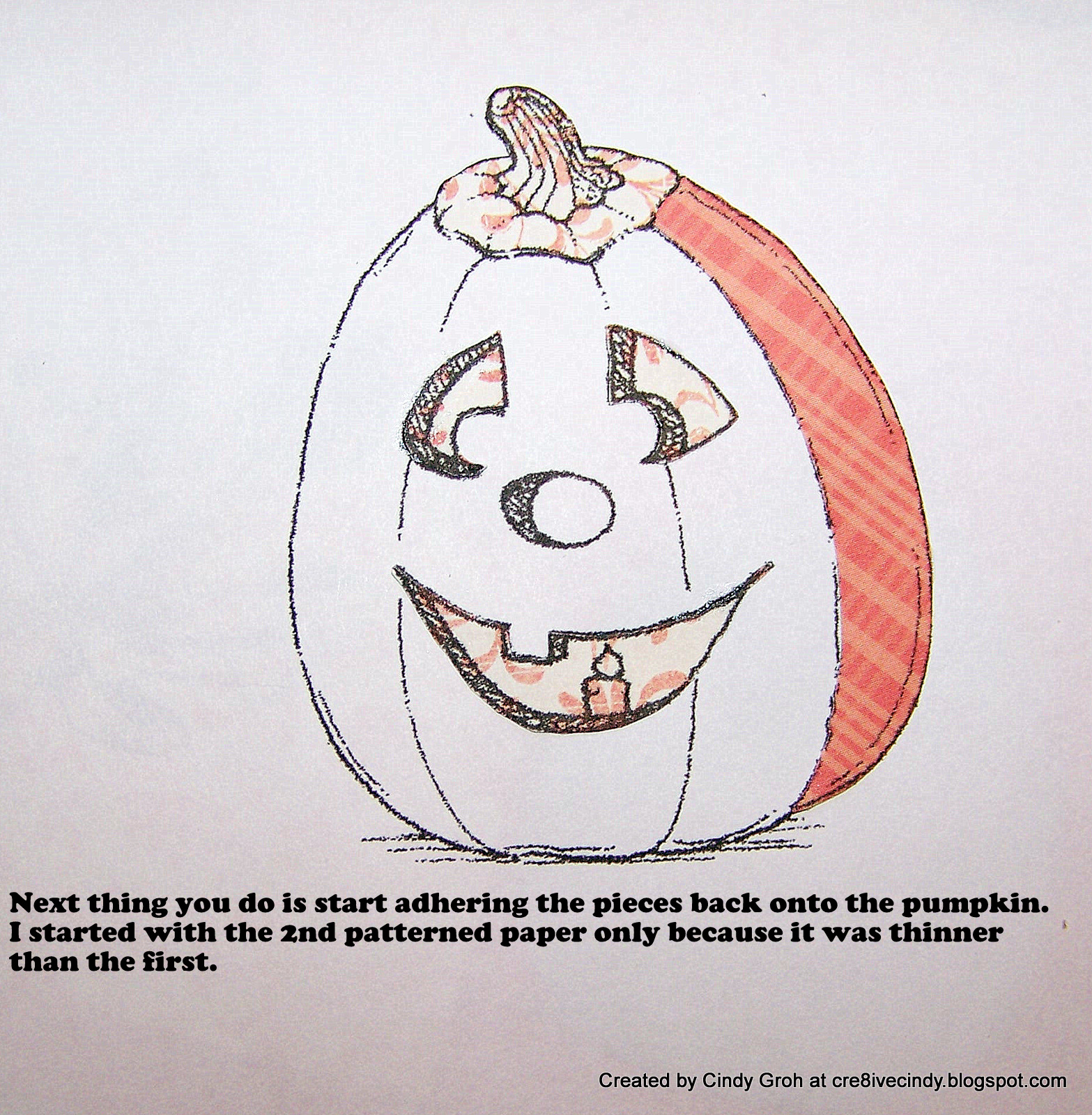
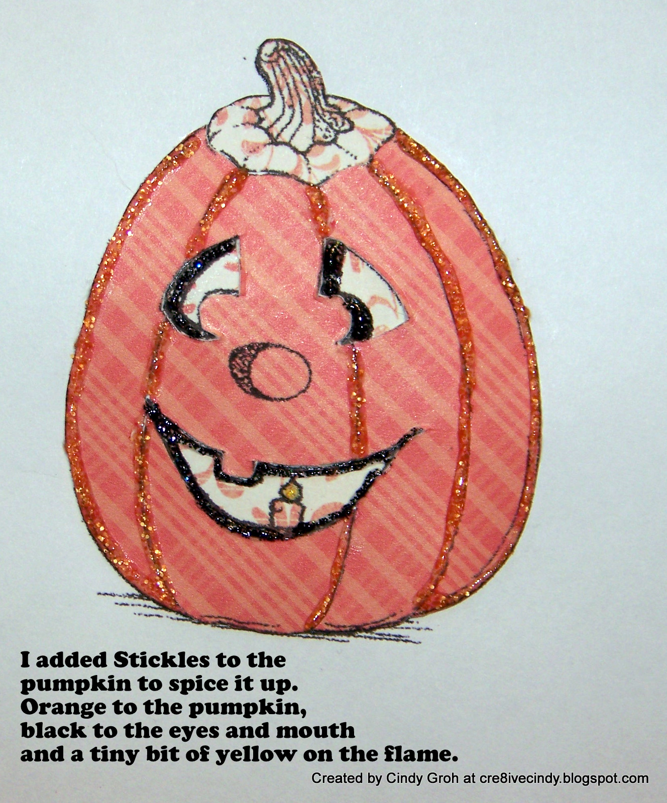
I made this pumpkin card and was asked to make it into a tutorial. If you use this tutorial, post me a link in the comments and I'll get the first person to leave me a link a prize. Fair enough, don't you think?
The image is by Robyn's Fetish where all inventory is 35% off right now. Check out our I did it Creations challenge blog for this weeks Halloween challenge.


Well some of the photos look a little fuzzy. Sorry about that. I hope you get the idea though. Best wishes and I can't wait to see what you come up with.