Tuesday, September 29, 2020

1973 Roller Press to iron clothes Scrapbook Layout and a Pocket page to match

1973
Look for another '73 layout at the bottom of this post.

I used alphabet stamps by Close to My Heart
The date is cut out with my Cricut
The patterned paper is by I'm not sure on the background
The strips of paper with the stamping are from Creative Memories
I cut the hole out of the darker green and found a lighter green cardstock for the left. It looks like the corner was folded during the creating process. Fix it up, AKA I'll cover it up with a sticker when it comes back.


The matching pocket page is a stretch. I pulled out the reddish-brown color from the layout for the top row on the pocket page.
Stamps:
NYE Alphabet-Michael's dollar bin (1973 die-cuts are by Quickutz)
Clock-Stampin Up
Labels and funny only to me statement on the top row third card stamps-Lawn Fawn
Center stamp by Unity Stamp Co.  I fussy cut the shape and that's Paul's Mom's handwriting
Talking about the same middle card-it was dry embossed with a Fiskars texture plate. Old for sure.
Leaf punches and patterned paper are by Creative Memories.
Bottom row patterned paper by Making Memories


Thanks for looking

Monday, September 28, 2020

Manly Monday You mean the World to us Card

I thought a card for Manly Monday would be a nice break from the Groh family layouts.

I used a stamp of the world by PSX
I colored the rubber stamp with different colored distress markers. 
I huffed on the stamp to remoisten the ink on the stamp and stamped it onto a white circle.
The sentiment is by Lawn Fawn alphabet Harold
The die- cuts are by Spellbinders and Sizzix
The patterned paper is by Die Cuts with a View
Border punch by Tim Holtz
Embossing folder by The Paper Studio


Thanks for looking

Sunday, September 27, 2020

1972 Snowing in October Scrapbook Layout and Monkeys in the Pocket Page

Typing up all of the products is tiring. 
I need to toughen up!

I used the word stamp, October, by Heidi Swapp
The stickers are by We R Memorie Keepers
The die- cuts are by Cricut (date) and Quickutz (names)
The patterned paper is by Me and My Big Ideas
There are some close-ups.


I feel as though I've already posted the "matching" Pocket page but here it is again.
First square:
The background paper is by Provo Craft.
The calendar is unknown.
Stamps by Stampin Up and Hero Arts birthday stamp 
The rest of the paper are scraps from my stash.


Monkey sticker by Recollections
Border by EK Success
The patterned paper on the bottom by Creative Memories
Sentiment stamp by Close to my Heart.


Thanks for looking

Friday, September 25, 2020

1972 Blue and Purple Pocket Page and Scrapbook Layout

Chugging along with 1972
I used number stamps by Stampin Up on a die that I bought on eBay
The patterned paper is by Pressed Petals (stripes) and by Deja Views (script font background)


Then for the pocket page:

Top left square: 
Patterned paper by Making Memories and cardstock unknown
The border punch by EK Success
Cake sticker by Jolee's
Date stamps by Close to my Heart
Journal box by Colorbok
Marker by Creative Memories.

Center square: patterned paper by Papertrey Ink

Center row left square: 
Border punch by Martha Stewart
 I painted the cardstock with powdered chalk mixed together with white paint both by Stamp N Plus (no longer in business) 
I inked the heart stamp with multiple colors of Versa Color ink and heat embossed it before cutting it out and cutting out a purple cardstock that you see behind it.
The letter stickers and reception sticker are unknown.

Lower left corner:
Crown die-cut by K and Co.
The letter stamps are from Michael's dollar bin


This is the same photo as above but scrapped in different colors for a different boy's book


I hate the next two pocket pages. There are way too many different papers. The busyness takes away from the photos. I might redo it but for now, it stays.

I used an unknown background stamp and heat embossed the suitcases with gold and added distress ink 
I used number stamps from Stampin Up. The other two fonts are dollar bin at Michael's font stamps
The die-cuts:
Green label die is Cricut
The peace sign is a punch by Marvy
 The gords are from K and Co.
 The circle in the center of the second page is something I received in a goodie bag at a crop 10 years ago. I dry embossed it and added distress ink. The brown sticker border sticker is by Creative Memories
The patterned papers are by Making Memories, October Afternoon, Die Cuts with a View, and Me and My Big Ideas


Thanks for looking

Thursday, September 24, 2020

1971 Paisley Pocket Page and Scrapbook Layout

I have to say, It was fun to use purple.

I used my Cricut to make the year die-cut  
The paper is a bold color and I think it makes the number stand out. 
Under the year, are 2 layers of patterned paper by Creative Memories 

The paisley patterned paper is by Die Cuts With a View
Other patterned papers that are here and there are by Creative Memories and Crate Paper. 


On the second page, I used stamps by Close to my Heart for the year. 
I really like this stamp set because it has great bold numbers in easy to read fonts. 
The black ink by Hero Arts also helps to make it stand out.

The right side border includes:
The Die Cuts with a View paisley paper 
Creative Memories paper and journal box
Border punch by Fiskars.
Striped paper by Colorbok
Epoxy circles on top and bottom of the date are by Miss Elizabeth's. 


Here's my 2-page spread all together


Same photo for a different book.


Thanks for looking

Wednesday, September 23, 2020

1970's Making Wine Layout

There are so many different...things about this layout that I don't even know where to begin but I'm going to try until my hands hurt and won't let me type anymore.
Here we go.
This LO sat on my desk waiting for the perfect thing for the center. 
I found a vellum sentiment. Yay!
Scroll down to picture 2.


I ran it thru my Xyron machine and it was at the end of the roll which made the adhesive splotchy and it had cardboard from the roll stuck to the vellum. BOO! That's not the word I used. It was more like some F's, some SOB's, and a favorite one that I have to say way too often, Are you F-n kidding me? 

Anyway, what sucks about this whole thing, is I checked the roll before sending the vellum thru and everything looked good to go. Umm, not so much.
So, the next picture.


I sent this photo to Ali, along with 2 other other mess ups that will be posted in the near future and she calmed me down. Thank you Ali.
I looked in my stash, which you all know, it takes forever to go through your stash to find that one thing. Plus it makes a hurendous mess because you pull out of fun things that you forgot you had. SMH! 
So I finally found CM stickers that matched the colors of my layout. I used two of them. But most importantly, this circle went over the tear. Yay!


Patterned paper by K and Co


Rust-colored cardstock is by Color-Aid and off white cardstock  used on the Cricut die-cut is by Bazzill
Chipboard wine and glasses by Paper Accents
They were painted with Ranger Industries copper paint
Letter stamps by Michael's for the wine label 


Journal box by Creative Memories. It was pink and turned rusty colored with the help of Distress inks.
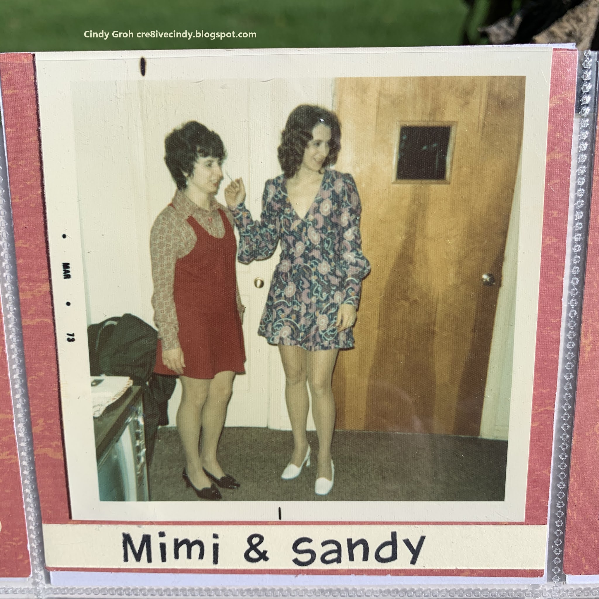
That is Mimi's (My precious MIL) handwriting. 
Side note: In the beginning of this project in 2014, she was helping me. She had just gone into an assisted living home and I was newly disabled. At that time I could still drive and pick her up to do things. It was good bonding time.
Anyway,
Chipboard grapes are by Paper Accents. I painted it with white Distress paint as the base and then I watercolored with distress ink. 


The last thing to this layout, I used 
to create a little card for a pocket page but I ended up scrapping these photos instead of doing a pocket page.
The circle sticker is by CM


All together one more time.


Thanks for sticking with me during this busy month. 
Going forward, you will see me posting more layouts than cards. 
I need to get them off of my PC and onto the blog/web.
Thanks so much for looking

Saturday, September 19, 2020

This Special Little card comes your way....

I love this sentiment for donation cards.
The patterned paper is by The Paper Studio 
The die-cut is by Sizzix 
Border stickers by Mrs. Grossman’s
The sentiment stamp is by Great Impressions


Thanks for looking. You can stop here.


Before I go...
I have a small rant on the new Blogger format.
It has been such a hassle for me for the following reasons:

Adding labels takes soooooo much time. 
Click here. 
Move cursor. 
Type in there. 
Click label. 
Click apply here. 
REPEAT FOR EACH LABEL!
And I have to point out that the delete icon is right next to the label icon. Buyer beware.
So what's the big deal? I like labels. 
I can go to the search box and type the word Graduation.  
~Poof~ my graduation projects appear. I can look and see if I've posted a project before or just scroll thru my old stuff 
Side note, in 2009 when I started my blog, I didn't know what labels were and didn't use them. So when I see an old post without labels, I add them. My complaint is, adding labels to those old posts was easier and took less time with the old Blogger format. 

When I load a picture to a blog post, the pictures are sized as extra-large. Now I admit, the XL pictures are nice to look at to see the detail of the card or LO but that size picture doesn't fit on my Blog's template. 
So that is something that I could fix but don't know exactly how.
UPDATED PIC, WORDING, SPACING 10-4-21

Thursday, September 17, 2020

Garfield with his bunny slippers card

This was another donation card to someone that likes Garfield. 
The orange polka dot in by My Mind’s Eye 
The rest of the die-cutS are by Spellbinders
The Garfield stamp by PSX and colored in with Copic markers 
Heart stamps that make up the background are by Lawn Fawn with Hero Arts ink.
The sentiment is a word bubble sticker that I’ve had for 15 years. I often think, why am I keeping these stickers? Why, because you never know when you’ll have a card like this needs one of those stickers.


Thanks for looking. Have a great day.

Wednesday, September 16, 2020

1970's Boys Playing Pocket Pages Layouts

In the Groh family, these are the kinds of things done by 4 boys and a husband.

I used stamps by Cloud 9 (boys will be boys) and Deep Red Stamps on the bottom card
The die- cuts are by Spellbinders and Colorbok
The patterned paper is by Die Cuts with a View, 
The wood veneers are by Maya Road


This card was an experiment using Close to my Heart stamps Hero Arts ink. Would the stamps continue to have a crisp look on the wood even after it dried?
I think it did. I like the end results.
I made a banner out of the wood pennants by Maya Road attached together with embroidery floss. 
The upper stamping looks horrible but I decided not to redo it for time reasons. 
I placed small brads in some of the open spaces. 


I used stamps by Deep Red Stamps on the card below. 
The tag is a Creative Memories punch and I stamp the 


Thanks for looking

Sunday, September 13, 2020

Graduation Wish of Many Bright Tomorrows card

Sorry I’ve been absent. I have been scrapbooking at our cottage. 

The sentiment stamp is from an old Stampin Up set. 
The die- cuts are by Spellbinders
The patterned paper is by Bazzill (bottom layer), The Paper Studio (top layer), and Papertrey Ink (die-cut red polka dot paper)


Thanks for looking

Thursday, September 10, 2020

Dry Embossed Happy Graduation Cards

This first card is my favorite out of the three cards.

The dry embossing folder is a Darice folder
I used a graduation stamp by TPC Studios 
It is white heat embossed
The Happy die sentiment is by Clearly Besotted 
The diploma Sticker is by Jolee's


The next card: Dry Embossing is a Cuttlebug folder
I inked the embossed words with Firebrick red distress marker.
The border is an oldie from my sticker stash.
The triangle and circle were scraps I found when I was cleaning my craft room.
IMO It’s not a good card but I have a feeling that the boy/young man that received it only cared about the contents inside.


I had higher expectations for this card because I used Firebrick red distress oxide ink on black cardstock. It looked great when I applied the ink but I was shocked and disappointed at how pink it turned out after it dried. What!
I still went with the original plan for this card to be red and black by adding red cardstock behind it and red washi tape from Stampin Up at the bottom.


Thanks so much for stopping by and taking a look at my new posts.
UPDATED PICS, DESCRIPTION, LABELS 10-1-21

Wednesday, September 09, 2020

1970 Beautiful Mom Layout and Pocket page to match

Welcome to the 70's

I used number stamps by Stampin Up in the Spellbinders die-cut at the bottom. 
I inked the outside of the die-cut.
The name and age are alphabet stamps by Lawn Fawn
All of the other die- cuts are cut out using my Cricut.
The patterned paper is by Doodlebug
The flower sticker at the bottom


I added more to the matching pocket page than I usually do. 
The stickers are old ones by Making Memories.


So there's a story with the station wagon. My husband and younger brother always had to sit in the way back of the car which was facing backward. This would make his motion sickness brother barf every time-per, my husband. His other complaint was the toxic fumes from the car that he had to inhale. All of that made him have a "horrible childhood. "
I found this car pattern on the back of My Mind's Eye paper that I bought for the front side.
I had to use it for this photo.


Orange, brown and outside gold border stickers


Yellow and brown oval sticker. 
I covered up a word that I would never use with the picture.


This sticker is one of those that you would fold in half as a pull out tab, I think. 
I stamped the date with Close to my Heart stamps.


Tiny little sticker in the corner by Karen Foster.


Thanks for looking