Showing posts with label alcohol inks. Show all posts

Monday, April 27, 2026

Manly Monday Alcohol Ink Backgrounds


I made these backgrounds with alcohol inks on photo paper. The sentiments are cut out with my Cricut. The turtle stamp is unknown. I stamped it with Memento Black ink and colored him in with Copic markers. Thanks for looking. HAGD! 


Friday, April 26, 2024

Floral Friday Alcohol Inks and Sunflower Card


I made this background with alcohol inks. This lovely sunflower found its way onto my desk and it matched the paper just beautifully. I added Stickles to random areas of the flower to give it some sparkle. I had some rub-ons of a straight stitch in the yellow-orange color.
 The last thing I did was glue on the “happy” sentiment die cut by Clearly Besotted and when I was doing that the glue got all over the letters. To fix it, I brushed gold Perfect Pearls over the letters.
The flower stamp is by Stampendous. They went out of business in September of 2022, Please correct me if I’m wrong. 
Why is this important? I’m going to tell you. I purchased the dies because they were less than a dollar. I was going to look around for the matching stamps. It never occurred to me that the company would go out of business and I wouldn’t be able to get them anymore. Having the dies was a bit pointless until a friend shared with me to color copy the images on the package to use with the dies. I didn’t know you could do that after the company went out of business. Kick butt!
Thanks for looking.

Tuesday, August 17, 2021

Deep Red Stamps Garden Girl Card

The little Garden Girl stamp is by Deep Red Stamps and I colored her in with Copic Markers. The sentiment is a sticker. The flower pot die-cut is by Dies...To die For. The patterned paper are scraps from my stash. Brads of garden tools are from Eyelet Outlet. The flowers in my card are punches from random companies. The paper was photo paper scraps that I inked with Ranger's alcohol inks. I used distress ink for the background. Jute by Tim Holtz


Thanks for looking

Monday, May 03, 2021

Manly Monday Run for Hamburgers Card


I made this card for my BIL thanking him for all of the wonderful things he does for us. He liked it.

I wanted this to be more than just a Cricut cut out card. A break out of the norm. 

Then I remembered that for whatever reason, I had these scraps of photo paper sitting around.
So, I used them with alcohol inks and made my own tan paper to go behind the burger buns and a brown for the burger patty.
Nobody’s going to know that or care but I enjoyed the change in creativity that came to mind. 

The food stickers are by Mrs. Grossmans

The die-cut is an intentional negative Cricut cut. I put white scraps of paper behind the sentiments.

The cookie patterned paper is by The Paper Studio 


I’m determined to use the stuff in my craft room. 
I bought it for a reason and maybe that reason has changed or the products are out of style but the bottom line is, if I’m not going to use it, then I need to get rid of it. 
These food stickers have been in my stash for probably 10 years. They are corny but I rather like how they give a reason to the cookie background paper.

Thanks for looking

Monday, July 20, 2020

Manly Monday Frog with Textured background Card

I used stamps by Etsy (frog) and Hero Arts (Lily pads)
Colored the above with Copic Markers
The sentiment is by Lawn Fawn
I fussy cut the leaves out
I alcohol inked the background,
Dry embossed it with a Cuttlcebug folder and
went over it with distress inks and oxides


Thanks for looking
Here are some other cards using the same stamp.

Friday, June 26, 2020

Fishy cards by Lawn Fawn

I have a bunch of cards today.
Inside each one is the sentiment Just Keep Swimming.

I used stamps by Lawn Fawn and Close to my Heart for the sentiment 
Most of the fish are colored with colored pencils but there are a few with Copic markers in there too.
The border dies are by eBay and Spellbinders
The patterned paper is by My Mind's Eye and Creative Memories for the sand

The sunrays in this first card, are a stamp that I acquired through the years.
These two cards are long and skinny. You can see their pattern on the edges of this one.
Using things up in my stash.


I heat embossed the same sunray stamp using Colorbox ink and clear embossing powder.


For this next card, the background was made with alcohol inks.
The border die by Spellbinders and is inked with distress ink
The sand is patterned paper by CM


The sunrays in this next one were made with a Tim Holtz stencil and a Ranger gold spray.


The background stamp is silver pigment ink that says Thank you 
Then I inked with distress ink.


Thanks for looking.
Here are some other cards using the same stamp.
ATC’s with Lawn Fawn

Tuesday, April 23, 2019

Deep Red Stamps Summer Hello Card

I made this card with the Deep Red Stamp Summer tiles stamp.
I stamped them with Hero Arts ink and watercolored them in and punched them out with a square punch (CM). Hello die by Lawn Fawn. Brackets cut out of Cricut (Bazzill cardstock). Center square and squares behind the tiles are Alcohol inks by Ranger. The strip of paper across the center is watercolor paper by Strathmore that I inked with Distress Ink. The white cardstock background is by GCD.


Here is another card using the same stamp set.
Summer Card

Thanks for looking

Tuesday, July 17, 2018

Framed butterfly ATC's

I used up some frames by Making Memories. The butterflies by Recollections I stamped with Colorbox ink and die cut out with matching dies. The background-Alcohol inks and stamped with a Tim Holtz stamp.


The second one, border punch by Fiskars and the background is patterned paper.


Thanks for looking.

Friday, June 30, 2017

Bad Medicine Cards Using Deep Red Stamps

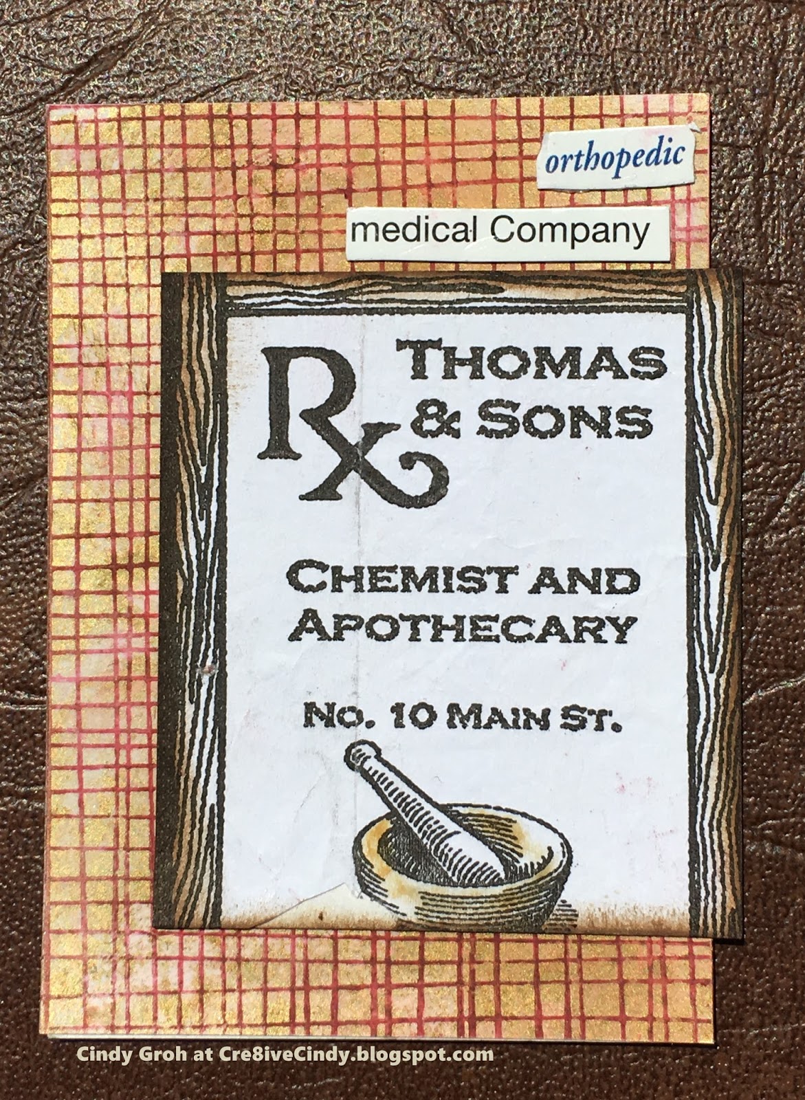
The ATC swap theme is medicine. I made these cards with a saved bag from a prescription. The first one:
Background-alcohol inks on glossy paper.
Stamped in brown Deep Red Stamp Weathered Wall.
Other labels are from a cream box.


The second background:
Alcohol inks with a gold fixative.
Stamped with Colorbox red pigment ink.
Edges inked with distress ink.


Thanks for looking
UPDATED PICS AND SPACING 10-4-21

Thursday, June 15, 2017

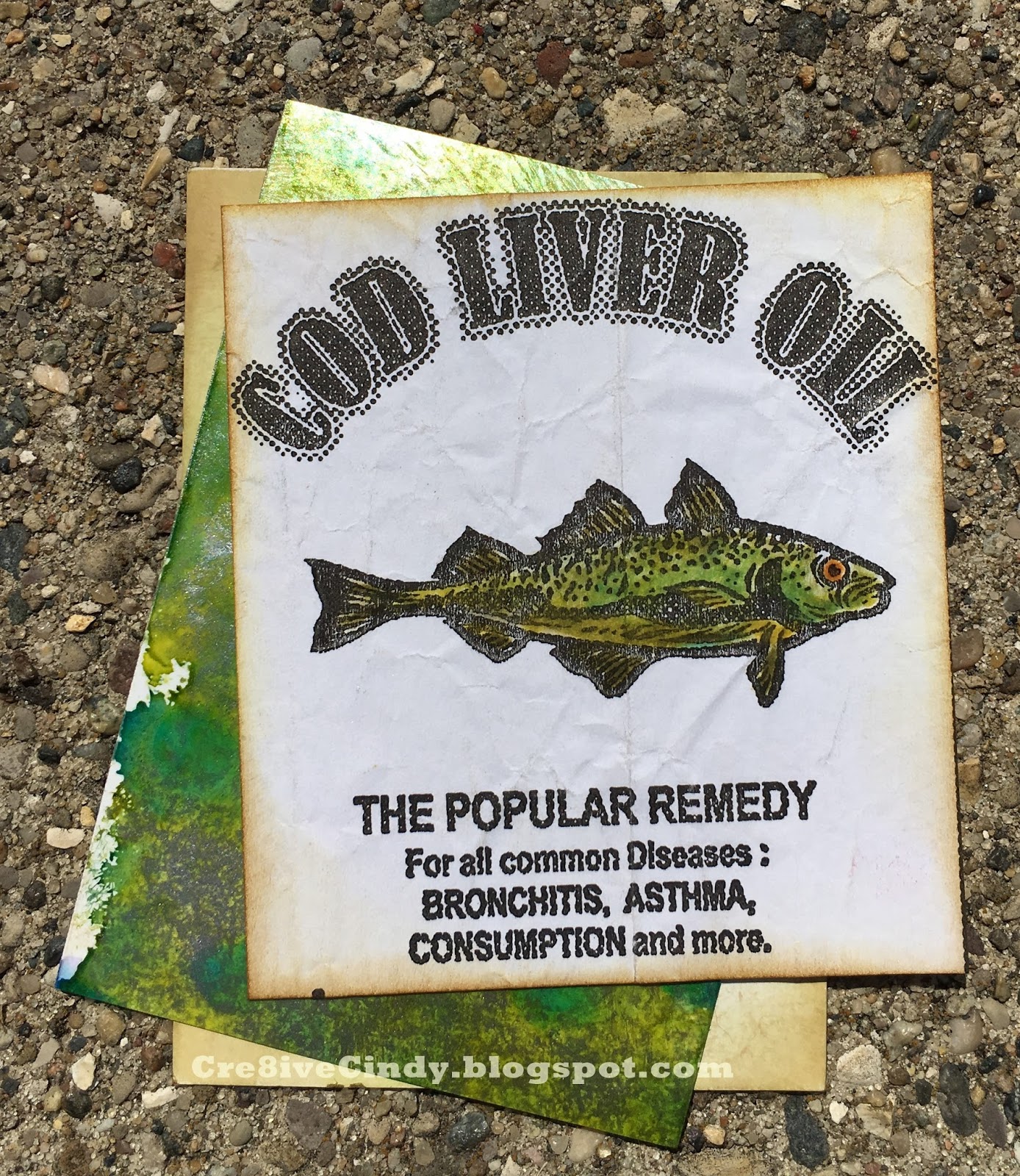
Cod Oil Cards

 The ATC theme is medicine. I chose to use a bag that had images like this on it. I cut it out and inked the edges with  distress ink  before coloring in the fish with markers.  The green glossy paper is inked with alcohol ink from Ranger. The last piece of white paper I inked with brown distressing. 


Thanks for looking

Monday, October 31, 2016

Manly Monday Catch You Later

I'm trying to get Manly Monday back into the blog posts. Today's card uses a stamp by Great Impressions that I stamped with Hero Arts ink onto watercolor paper by Strathmore. Then I colored the image in with distress ink. The orange background is glossy paper that I inked with alcohol inks. The road line is a TPC Studio stamp that was stamped with white pigment ink by SU and heat embossed with clear embossing powder. I took a yellow pen and filled in the lines of the stamp. The background paper is by We R Memory Keepers. The sentiment is a Cricut cut from Just Because Cards cartridge.


Thanks for looking.

Monday, October 15, 2012

Christmas Cards all year Round


I made a few more cards for the challenge at Christmas Cards all Year Round.

Create a card using a non traditional image with traditional Christmas colors 

OR

Create a card with a traditional Christmas image using non traditional colors.

I used stamps by Hero Arts, ink by Tsukineko, and embossing powder by Stamp N Plus, die cuts by Spellbinders, cardstock by Bazzill and Pioneer, Pearls by Recollections, patterned paper by DCWV.


Cardstock by Bazzill, patterned paper and ribbon are unknown, die cuts by Spellbinders, stamps by Studio 112 and Stamp N Plus, ink by Tsukineko and Colorbox.

Both cards use a thick foil for the main image that I ink with Ranger's Alcohol inks. 

Thanks for looking.


Thursday, October 04, 2012

Stamp N Plus birthday


My husband and I sell bottle caps at a local scrapbooking store. I love to try new things with them. This cap is from Coor's Light. I covered it with alcohol inks, a sticker and Glossy Accents. I layered the cap with some Spellbinders die cuts. 

The embossing folder is by Provo Craft and the flourish sticker is by Chatterbox. The patterned paper is by K and Co. The sentiment is by Stamp N Plus however it is not on the website. I've taken a picture of the sentiment set that this stamp comes in. See it below my card. The ink I used for the sentiment is by Stampin Up and the ink for the edges is by Ranger Industries.

Thanks for looking. If you are interested in obtaining some flattened bottle caps click the email me button on the right side bar. I'd be happy to send you some samples. 


If you are interested in purchasing these sentiments please call Luann at 715-271-1873.

Sunday, May 27, 2012

One Stitch at a Time challenge


This week at One Stitch at a Time the challenge is to use Red, White and Blue. My image is by Delicious Doodles called Steampunk Corner. There are so many awesome images to choose from. I really enjoy Teri's style.
So here is my graduation card that I made using the corner. I printed it on photo paper and then used blue alcohol inks to give it that rich blue color. Thanks for stopping by


Sunday, March 04, 2012

Cupcake card Robyn's Fetish Challenge #97

This week at The Robyn's Fetish Challenge our theme is Cupcakes. We are sponsored by

Limited Runs Digital Stamps.
The company is still around as of March 2019

They have a ton of fun cupcake images. You must check them out. I got the apple cupcake and had fun coloring it in with my Copic markers. The pink die cut I made using alcohol ink on glossy paper. I used some of my Copic marker refill ink to get just the right color to match the image. I then cut the die cut using my Cricut and the Storybook cartridge.
The background stamp is by Hero Arts and I heat embossed it with white embossing powder. I then used my distressing tool and Sugar Spun distressing ink to give it a pink hue. 
Thanks so much for stopping by. Have a great Sunday.


Challenge:

Monday, January 30, 2012

Manly Monday Tim Holtz Man with an Umbrella Card

This card is similar to an orange Manly Monday I posted recently. I loved the way it looked in blue and had to share it with you. I used alcohol inks on glossy paper, stamped the man in Memento black ink, and then embossed it on my Cuttlebug.
Thanks for looking.
UPDATED 6-3-22

Monday, December 12, 2011

Manly Monday Man’s Silhouette with an Umbrella card

This week for Manly Monday I made a card using a Tim Holtz stamp set, alcohol inks, Provo Craft embossing folder, Memento and distressing Ink, tag by Making Memories, sentiment by Maya Road and some cardstock and brads from my stash. Thanks for looking.

Don't forget to check out my post where you use a Fabulous Friday Fun tip or product for a chance at a fabulous prize.


Tuesday, December 06, 2011

Christmas sparkle

Click here for the CHALLENGE WITH A PRIZE
It's super easy to qualify. Check out the post and link up.

Just a little glitter to make your day sparkle.
Thanks for looking


Challenges:
http://www.craftyourpassionchallenges.blogspot.com/(M#87)-Anything goes with glitter
http://heartsonginspirations.blogspot.com/(M#27)-Red green and white
http://kaboodledoodles.blogspot.com/(M#96)-Colors of Christmas
http://mimchallegeblog.blogspot.com/(M#27)-Glitter

Friday, November 18, 2011

Fabulous Friday Fun

UPDATE LABELS, LINKS, AND PICS ON 10-1-21
This week I am going to touch on Alcohol Inks by Ranger Industries. It is hard to show the process in still pictures since you have to work kind of quickly. I learned how to use alcohol inks from a scrapbook store owner. It's different from the way Tim Holtz demonstrates them in THIS old YouTube video. It just goes to show there's more than one way to use products. I think everyone likes to learn new ways to use products they may already have or were thinking of trying.

Here's a little bit of information about this card that I'd like to share with you before we start. First, I had this image from Robyn's Fetish  (see below) already colored in and wanted to match the green in the leaves to the paper. I have the alcohol ink color Citrus but the green I was looking for was more of blue-ish green. We were all taught at a young age that yellow and blue make green and so I was willing to mix Sailboat Blue and Sunshine Yellow to find the color that matched my colored image just perfectly.

Second, I didn't buy a blending solution or the tool to apply the alcohol inks. The store owner taught me that regular under your bathroom sink alcohol would work for a blending solution. I had an empty bottle from a dollar store three-pack that I poured the alcohol into and that serves as my blending solution. Then I had my husband cut me a few pieces of wood and put some self-adhesive Velcro on them to act as my tool. I bought some cheap felt from a craft store and cut squares the size of my block. The felt sticks to the Velcro making this a cheap alternative to the Ranger tool. Here's the thing, I've never used the Ranger blending solution or their tool and they may work better than my homemade alternatives. But for cost sake, I would rather be able to buy different colors of alcohol ink with the money I saved rather than the tools.

OK, on with the show!!

Supplies:
1.) I used this image from Robyn's Fetish:
2.) Inkessentials Glossy paper
3.) Alcohol ink pack 
4.) Pearl Mixative
5.) Copic markers G02, G05, G07, R24, R29, R39 and R89

The rest of my supplies came from my stash.

Let's begin. This first picture shows my alcohol inking supplies (minus the "blending solution" AKA rubbing alcohol).


Then I'm going to mix the blue and yellow together on the felt. I started by lightly squeezing the bottle in three different places on my felt like my picture shows.


After the blue, I added the yellow to the felt and then some alcohol to the felt as well. On the paper, I place little drops of Mixative all around. It gives the whole paper a sparkle instead of just a couple areas that you get when you add it to the felt.


From there you just twist the felt block onto the drops to mix them all together. For my first attempt at matching the green I ended up with this:


It was too yellow to match my holly leaves. I cut another piece of paper, added more blue to the felt than yellow, and came up with this:


So you are probably thinking they look pretty similar. Here is a picture of them side by side:

Now you can tell the top paper is bluer than the bottom paper. As you may recall I said you have to move quickly with the way I do it and the pictures prove that. The small circles you see in the papers are the mixative. If I were to blend the colors faster before the mixative absorbs into the paper, I wouldn't have those circles. I would come up with a more even distribution.

Here is a close-up of my card with the alcohol inked paper (the top paper from the last photo). Once it dries and with a little strategic placement of embellishments you can't see the circles of mixative on the paper as much as you do in the pictures above.


Here is my card all done (the sun decided to poke out for the picture):


I think the green in the holly leaves matches the paper well. I hope you enjoyed this brief tutorial on how I used alcohol inks on my card and you will be inspired to pull yours out for your next project.

Remember if you do use alcohol inks on your project and post me a link in the comments field of this post I will send you a prize.